
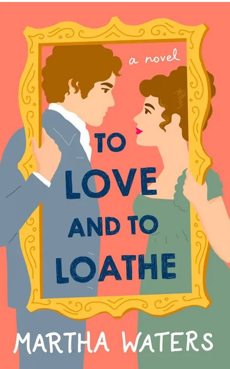
This morning while surfing Amazon to check out two new books that were recommended by BuzzFeed for Spring release (The Duke of Undone and To Love and to Loathe) the page loaded with more recommendations. Each of the covers displayed the new cartoon-type artwork that seems to be a new trend being pushed by traditional publishing companies. These came from St. Martin’s Griffin (Macmillan), Berkley (Penquin), Atria Books (Simon & Shuster), and Kensington Books. (Shame on Kensington, because they used to have some of the most beautiful artwork when it came to covers.)

Is it just me disappointed with this new push? What’s behind the change from the big houses? Is it to save money? Brand themselves apart from independent authors?
What are your thoughts? Chime in on the comments.
Yea?
Nay?
Okay?
Ugh? I think it’s obvious that I’m in the “ugh” category. Give me artwork and wonderfully design covers any day.


Personally, I don’t like them. They are cartoonish. . .would be okay if it were a humorous historical.
LikeLike
I’m not a fan. I love a handsome couple on the cover of the books I buy. These cartoon covers feel cheap.
LikeLike